Tuesday, 30 October 2012

Perfect Guide

Our next Graphics project was to make the perfect guide for something, a cup of tea was suggested, throughout life this suggestion of writing guides about making a cup of tea have come up again and again and I don't know why. I can sum it up in a couple of sentences: "Put a teabag in a mug, add boiling water. Stir, wait a sec, take the teabag out." anything beyond that is your own preferences, if you need a guide to help you accomplish this task then maybe it isn't safe for you to be boiling water.

Anyway, my initial thoughts were getting about in London for people who don't usually travel around London and Masturbation because I thought I can do something rude and possibly funny - but who would be the audience of such a guide? I thought maybe Muslims as it would be offensive (just read this back and want to point out, I'm not racist, I want to offend everyone), but I don't have a circumcised cock, so to get the drawings right I would have to look it up, and I didn't want to base a project around drawing someone else's knob.

I realised early on that the trick to making a perfect guide was all in the audience, the more specific your audience the more perfect your guide would be. A lot of other students didn't get this, and I spent one Wednesday morning trying to get it through to them that their idea was shit if they were trying to address everyone. This idea was similar to mine, so worth bringing up: "a guide to Oxford street for tourists" which tourists? "all of them". How can the guide ever be perfect unless it is in all of the languages? Thankfully most of the students got what I was getting at and tailored their idea to a much more specific audience.

I decided that the specific group of non-londoners my guide was for where Northerners, then specified it to Leeds. My dad's from Leeds, I've been there a fair few times to see my grandparents and that meant that of all the places in the north of England it was the one I was most familiar with (and it meant I could get some good first hand referencing from my dad by asking him about his thoughts when first going to London, to really get inside the head of my audience).

Northerners behave quite differently to Londoners, and I aimed to capitalise on this difference with various jokes that would take the piss out of both (being from the Midlands I'm obviously the perfect mix of north and south; Hard, yet refined, like a diamond!)

I had my subject and audience, the only thing missing was the delivery. What was the best way to convey this information? I decided that I would make an airplane safety video style VT that would be watched on coach trips from Leeds to London.

I interviewed my dad and the useful info was: London's the only place with integrated travel, don't chat to other people (my dad had an anecdote about asking somebody on the tube for the time the first time he rode it and the woman he asked thought he was trying to chat her up and took offence). At the time he went most pubs said no travellers and there was a definite atmostphere unfriendlyness and of only locals are welcome. London's on a massive scale, transport network being bigger than Belgium and lastly that the busyness, volume and speed of people was nothing like he'd experienced in Yorkshire. Lastly, that busses had doors in the middle which was surprising.

I watched a fair few in flight safety vids and they were all in a pretty ugly 3D animation style, I considered doing an animation for the VT but decided against it as this was for coach travel, and realistically would have a lower budget, meaning live action was more likely (and far more achievable for me).

I wrote the script in a yorkshire accent, and then made a storyboard. The key elements of the video were that I would chat to the camera in a pub, overlaying with graphics when appropriate and splicing in scenes of what I was describing, such as tapping in and buying travel cards, and hoping that scenes where Sajan (the busy Londoner) interacted with me (as the hapless Yorkshire tourist) would bring some humour to the video.

Here is the video I made:


I don't think that the outcome was as successful as I'd imagined, the idea is good but the video is too long and quite boring to watch. I recently read a section of "The Video Production Handbook" by Jim Owens and Gerald Millerson" that said inexperienced video editors use techniques such as rapid succession of unrelated shots or fast cutting between different view points to create an illusion of excitement for a dull subject. And watching this video back I get what they mean, the content should be interesting enough to watch without me doing the narration in 2 different directions. The way it is now is quite annoying to watch.

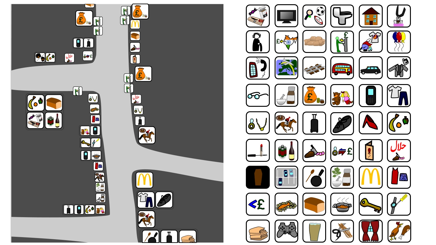
I also made a laminated card that would be found in the coach seat back pocket with the main symbols and info on:

This little bit satisfied my desire to make information graphics and draw them with vectors.

Making videos well requires a decent camera on tripod (with wheels if you're after a moving camera), lighting, a microphone and a team of people to operate these items, as well as whoever their filming. At this stage my work needs to be at a really high production standard, I can't keep making these videos that look so low quality. I dreamt that the strength of the idea was what truly mattered, but how do you get people to see your idea if they way its presented is unattractive? The next video I make needs to be shorter and look nicer, crisper, sound better!

Thursday, 25 October 2012

Illustration 1000 Drawings

We've been encouraged to blog about our illustration work but told to use existing blogs that we have. For this project we were told to go to a museum of our choice and do a thousand drawings. I chose the Natural History museum so that I could draw dinosaurs. The first day I went was on a sunday. The exscuse I gave for the small amount of drawings I did was that the museum was packed out but in truth I wasn't really sure how to draw quickly, so I didn't, and I allowed a dislike of what I was drawing to put me off.
I went back again and this time sped myself up, not letting myself get disheartened by unsuccessful drawings, they weren't all good but I was pretty happy with a few of the drawings from this trip.
I got some feed back that I ought to focus more on the forms and less on the lines, so I acquired a graphite stick, and at my next museum trip I vowed to only work with graphite stick and felt tip pens (to force myself into colour as well). Using a chunkier medium really loosened me up and I began to really enjoy what I was doing. I struggled to make the felt tip pens work that well, but the graphite stick made me remember that I like drawing a lot, and how lucky was I that what my project came down to was just drawing my favourite animals.
I went back and this time drew solely with the graphite stick, I did around a hundred drawings in 6 hours, not all of them worked but a lot of them did, and as my enjoyment of the project grew so too did my confidence, which allowed me to draw more ambitiously and so I enjoyed it more.
I finished the sketchbook, full to the brim with drawings and felt that what I needed was to increase my page size. I decided to add a conte crayon to my tool kit. I hadn't worked with conte for a while, it allowed me to create more medium tone that I could then layer a dark graphite tone over. By this point I had well over a hundred more drawings than most of the class, so I decided to slow it down a bit and create some longer studies of a few particular favourites.
Finally I returned to the museum with an A3 sketchpad and a pack of never before used (but owned for 3 years) landscape chalky oil pastel sticks. They were almost all earthy tones, which is fine for a lot of animals anyway, and just like squares. So I had moved from the fine point of a pencil all the way through to the a flat edge of a landscape pastel, and I'm very happy with the progress I made as a result.
I learnt that drawing is a lot like music. Each time you draw something it's like trying to play a song, you can't expect to master it right away, but if you keep trying and don't throw your guitar on the floor cause you miss a note, then you will learn how to play it, and you'll be better at playing your instrument in general, able to learn the next song more quickly. And also that everything you do that you enjoy will be a lot more successful than things you don't enjoy. I bumped into a lot of kids in the museum from around the world and had them ask me all sorts, I don't mind chatting to people, and I was in such a good mood drawing all the time I couldn't help myself from chatting to them about drawing. I even had a group of btec students ask me to be their art teacher they were that inspired by me, which was a really good feeling. I started this project embarrassed about people seeing my drawings, and by the end I laid a big piece of paper out on the floor to draw on so that I could almost invite people to see my progress.

Wednesday, 10 October 2012

10x10x10

After being put into the branding group our first brief was 10x10x10, it was a one day project, just to get our brain juices flowing again. My initial reaction was it's 10 cubed, so I need to do something where it gets multiplied by 10 each time, eg draw 10 things, draw each of those 10 things 10 times, then draw 10 drawings from each of those drawings, so that I ended up with a 1000 drawings, or model cubes inside each other or something else equally unfeasible and dull within a day.

There was a small clause within the brief though that caught my imagination: "a complicated game" - with all the thoughts of cubes in my mind I decided to invent a game, a simple game that had 3 different sets of 10 elements that could be combined in a variety of ways, and it might not allow for 1000 combinations but a fair few. And to satisfy my cube inclination I made a dice.

The game had 10 different battlefields, 10 different monsters, and each character had 10 hit points. The battlefields were Grass, Jungle, City, River, Ocean, Mountain, Sky, Desert, Arctic and Cave. I then came up with 5 adjectives that could describe each battlefield: Plains/outdoor, Water, Air, Dense terrain and Grassy and assigned these 5 different types to each sort of terrain. Grass was grassy (obviously) and Air, Jungle was grassy, City was dense terrain, River was grassy and water, Ocean was water, Mountain was plains/outdoor and air, Sky was air, Desert was plains/outdoor, Arctic was water and plains/outdoor and Cave was dense terrain.

I came up with 10 monsters that would satisfy the 5 different sorts terrain I came up with, these were: Stone Golem, Human Warrior, Fire Ghost, Laser Shark, Milipede, Dragon, Squid Alien, Well 'Ard Goat, Giant Spider and Ultra Eagle. Stone Golem was someone that would be good in plains/outdoor, Human warrior in dense terrain, Fire Ghost in grassy, Laser Shark in water, Milipede in grassy, Dragon in sky, Squid (I dropped the alien part) was water, Goat (I dropped his moniker as well) was plains/outdoor, Giant Spider was dense terrain and Eagle was sky. Regarding the names I wanted a mixture of typical fantasy creatures (Dragon, Stone Golem, Human Warrior, Giant Spider) as well as some mundane creatures (Goat, Eagle, Milipede, Squid) and a few oddball names people wouldn't have heard of before that might get a laugh (Laser Shark, Fire Ghost).


Having figured out roughly what was fighting, and roughly where it was better at fighting, I began making the battlefields and monsters out of card.

Each battlefield was a 3x3 grid (I thought that 9 squares within 1 square might satisfy one of the 10 requirements in case one of the other elements didn't). I coloured the 21cm square grids to represent the battlefield (for instance Cave was black with brown stalgtites).


Mountain
Desert
Sky
Grass
City
Ocean
River
Jungle

Arctic

The characters (henceforth referred to as monsters) would be represented by 7cm square cards that included a drawing of the monster, its name, its attacks, and its preferred battlefields. Using the terrain types as a guide and tweaking so that each monster had preferred terrain that made sense and each battlefield was roughly equally important (this didn't quite pan out, with some places like Arctic being quite common to fight in and some places like Jungle weren't).

I should probably explain the game rules briefly now, you and your opponent choose a monster each, each turn you then roll the energy dice (0-5), energy is used to move and attack. It costs 1 energy to move a square, unless you are in preferred terrain where 1 energy will move your monster 2 squares. Each monster then had an attack that cost energy. Better attacks cost more energy (eg Human Warrior does 1 HP of damage to an enemy 1 diagonal away for 1 energy, Squid does 4 HP of damage to an enemy 1 square directly in front for 4 energy) this meant that monsters that have stronger attacks can't move as far and attack in the same turn. Play goes on until 1 monster is alive.

I paired the monsters up in attacks and number of battlefields there were better in, so Squid and Dragon were equal, Stone Golem and Laser Shark were equal, Giant Spider and Fire Ghost were equal, Goat and Eagle were equal, Human Warrior and Milipede were equal.

Here are the monster cards:


Before we fed back at the end of the day I got a couple of my peers to play the game, and they were keen to do so, unfortunately it was shit. The grid didn't allow for enough movement and the game went on for far too long. The monsters needed to be different distances from each other depending on their attack, and rolling low on the dice meant that you didn't really do anything as it was nigh on impossible to roll high enough to move to the right position and attack. Ultimately the class was impressed by all the stuff I'd made but the game I'd come up with was excruciatingly boring to play.

Sunday, 7 October 2012

Graphics Presentation

We had to give a presentation about what things we had made and enjoyed doing before at uni so that the tutors could split us up into groups to make class sizes more managable and so that we had projects that let us work in the way we wanted to. I started with my universal language East Ham high street map because I wanted to say that I feel Graphic Design is all about communication.
I then showed my Illustration Health and Safety guide to an unhealthy and unsafe lifestyle so that I could display my skill at working with vector graphics.
I then showed some slides from my Guide to surviving the rapture for athiests so I could say I like to have a sense of humour when tackling a project.
Then I talked about how I like graphic design that has a practical application, so I showed my smib.
I then commented on how most of my responses to projects are either video or vector drawings. Lastly I showed what I had been doing for the summer by presenting a selection of the logos and videos I had worked on for small businesses back in Birmingham. Finishing by saying I did not want to spend the last year making logos.
As a result of my presentation I was put into the Branding group.