I took the vectorised drawings of my initial 10 characters and placed them within a hexagon, moving them around until I had a satisfactory window through the hexagon that showed off the character recognisably. Then I wrote the characters name around the edge, initially in my Battle of the Gods font, but at tiny sizes this was difficult to read, then in Carlson Antique, but it was too small to read in this font as well, so I used Garamond because it's like Carlson Antique but more legible at tiny sizes.

When the Monster Tokens first came back from the laser etchers they were burnt all around the edge from the cutting laser going over the same sections twice - this was because I'd laid them all next to each other on the illustrator file and was easily fixed. But I realised another another thing when I saw them, and that was that 9mm monster tokens look kinda naff, so for the 2nd attempt we used plywood the same depth as the cards.

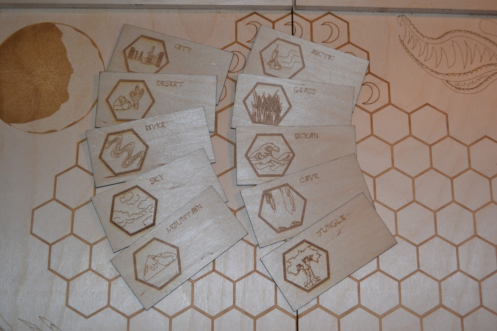
When it came to the cards I didn't really want to change the original design much at all, I prefer the idea of a landscape orientated card, I just needed to update the drawings to all be my own and the text and symbols had to catch up, but otherwise a pretty easy job. With the terrain cards I was able to use what I already had come up with except for Sky, where I'd used a bitmap of a vector drawing I'd done before because the drawing was such a big file (making realistic fluffy clouds) so I simplified this, and with the Sea card I decided to redo it as it looked like 3 floating turds, so I vectorised a scene of waves, not too dissimilar to the Great Wave off Kanagawa. The cards looked like this when I sent them off to 4D.


When it all came back from the Laser etchers the 2nd time they looked like this:


When it came to the obstacles I had to get them a little bit smaller than what I currently had, so I went to Camden and met Dan and Anastasia (Anastasia lives in Camden) and they walked me around the markets which I've been to but for a while. I had planned to get rocks the same as the black ones I had but a little smaller, I couldn't see those but I did find some that were like shiny metal, only flatter on 1 side each and a little smaller, which is exactly what I was after. I also felt that being shiny on my wooden board they'd look magical, and I think they do.
No comments:
Post a Comment