Wednesday, 10 October 2012

10x10x10

After being put into the branding group our first brief was 10x10x10, it was a one day project, just to get our brain juices flowing again. My initial reaction was it's 10 cubed, so I need to do something where it gets multiplied by 10 each time, eg draw 10 things, draw each of those 10 things 10 times, then draw 10 drawings from each of those drawings, so that I ended up with a 1000 drawings, or model cubes inside each other or something else equally unfeasible and dull within a day.

There was a small clause within the brief though that caught my imagination: "a complicated game" - with all the thoughts of cubes in my mind I decided to invent a game, a simple game that had 3 different sets of 10 elements that could be combined in a variety of ways, and it might not allow for 1000 combinations but a fair few. And to satisfy my cube inclination I made a dice.

The game had 10 different battlefields, 10 different monsters, and each character had 10 hit points. The battlefields were Grass, Jungle, City, River, Ocean, Mountain, Sky, Desert, Arctic and Cave. I then came up with 5 adjectives that could describe each battlefield: Plains/outdoor, Water, Air, Dense terrain and Grassy and assigned these 5 different types to each sort of terrain. Grass was grassy (obviously) and Air, Jungle was grassy, City was dense terrain, River was grassy and water, Ocean was water, Mountain was plains/outdoor and air, Sky was air, Desert was plains/outdoor, Arctic was water and plains/outdoor and Cave was dense terrain.

I came up with 10 monsters that would satisfy the 5 different sorts terrain I came up with, these were: Stone Golem, Human Warrior, Fire Ghost, Laser Shark, Milipede, Dragon, Squid Alien, Well 'Ard Goat, Giant Spider and Ultra Eagle. Stone Golem was someone that would be good in plains/outdoor, Human warrior in dense terrain, Fire Ghost in grassy, Laser Shark in water, Milipede in grassy, Dragon in sky, Squid (I dropped the alien part) was water, Goat (I dropped his moniker as well) was plains/outdoor, Giant Spider was dense terrain and Eagle was sky. Regarding the names I wanted a mixture of typical fantasy creatures (Dragon, Stone Golem, Human Warrior, Giant Spider) as well as some mundane creatures (Goat, Eagle, Milipede, Squid) and a few oddball names people wouldn't have heard of before that might get a laugh (Laser Shark, Fire Ghost).


Having figured out roughly what was fighting, and roughly where it was better at fighting, I began making the battlefields and monsters out of card.

Each battlefield was a 3x3 grid (I thought that 9 squares within 1 square might satisfy one of the 10 requirements in case one of the other elements didn't). I coloured the 21cm square grids to represent the battlefield (for instance Cave was black with brown stalgtites).


Mountain
Desert
Sky
Grass
City
Ocean
River
Jungle

Arctic

The characters (henceforth referred to as monsters) would be represented by 7cm square cards that included a drawing of the monster, its name, its attacks, and its preferred battlefields. Using the terrain types as a guide and tweaking so that each monster had preferred terrain that made sense and each battlefield was roughly equally important (this didn't quite pan out, with some places like Arctic being quite common to fight in and some places like Jungle weren't).

I should probably explain the game rules briefly now, you and your opponent choose a monster each, each turn you then roll the energy dice (0-5), energy is used to move and attack. It costs 1 energy to move a square, unless you are in preferred terrain where 1 energy will move your monster 2 squares. Each monster then had an attack that cost energy. Better attacks cost more energy (eg Human Warrior does 1 HP of damage to an enemy 1 diagonal away for 1 energy, Squid does 4 HP of damage to an enemy 1 square directly in front for 4 energy) this meant that monsters that have stronger attacks can't move as far and attack in the same turn. Play goes on until 1 monster is alive.

I paired the monsters up in attacks and number of battlefields there were better in, so Squid and Dragon were equal, Stone Golem and Laser Shark were equal, Giant Spider and Fire Ghost were equal, Goat and Eagle were equal, Human Warrior and Milipede were equal.

Here are the monster cards:


Before we fed back at the end of the day I got a couple of my peers to play the game, and they were keen to do so, unfortunately it was shit. The grid didn't allow for enough movement and the game went on for far too long. The monsters needed to be different distances from each other depending on their attack, and rolling low on the dice meant that you didn't really do anything as it was nigh on impossible to roll high enough to move to the right position and attack. Ultimately the class was impressed by all the stuff I'd made but the game I'd come up with was excruciatingly boring to play.

Sunday, 7 October 2012

Graphics Presentation

We had to give a presentation about what things we had made and enjoyed doing before at uni so that the tutors could split us up into groups to make class sizes more managable and so that we had projects that let us work in the way we wanted to. I started with my universal language East Ham high street map because I wanted to say that I feel Graphic Design is all about communication.
I then showed my Illustration Health and Safety guide to an unhealthy and unsafe lifestyle so that I could display my skill at working with vector graphics.
I then showed some slides from my Guide to surviving the rapture for athiests so I could say I like to have a sense of humour when tackling a project.
Then I talked about how I like graphic design that has a practical application, so I showed my smib.
I then commented on how most of my responses to projects are either video or vector drawings. Lastly I showed what I had been doing for the summer by presenting a selection of the logos and videos I had worked on for small businesses back in Birmingham. Finishing by saying I did not want to spend the last year making logos.
As a result of my presentation I was put into the Branding group.

Monday, 23 April 2012

Impressions of London

For this project we had to make 8 A6 post cards based upon our experiences of living in London.

I started with a london tube map, then I erased all of the stations that I didn't care about and filled the map up with my memories.
Photobucket

Then I edited it down to just the more eastern part of London, as that's more my part of London.
Photobucket

However, I then felt that London really is the centre, and that I ought to focus on that rather than the east end.
Photobucket
Once I had got the memory stations sorted out I chose the ones that I felt were the strongest memorys, which were: hyde park, Earls Court, Tower Hill, London Bridge, South Kensington, Trafalgar Square, Parliament Square and Euston Station.

I then got Gracey to accompany me about London, photographing me in the location of my memorys with appropriate props. This was part of a deal whereby I would then film her practising polo for her Jack Wills seasonaire video competition, which I'll have to put together for her and will probably be on my youtube channel at the time of reading this if you want to see it.

Then once I had a photograph of me in each place with my props I made them black and white to represent the past aspect of it, turned them into post cards and then wrote messages on the back, I typed the message out first and then had to edit it down to fit on when I wrote it in pen, here are my original sentiments:


Hyde Park:
Dear Grace and Neil, do you remember when we sat here on a sunday afternoon? We'd had a small party at my house the evening before, and then instead of going to sleep we dressed up smart and visuited Buckingham Palace before going to Hyde Park. I must confess my brain wasn't in the most well functioning state, but I enjoyed sitting in the sun here and drinking a tiger beer with you both.

Earls Court:
Dear Elena, because you're short sighted and don't wear your glasses when we meet (neither do I but at least I have contacts) I'd imagine you don't remember this scene; but I was enthralled to see that the Tardis is parked outside your closest tube station. You walked me back to your fathers house whilst he was away in Australia and we had that awkward moment where neither of us really knew where my hand that came around you ought to be.

Tower Hill:
Dear Ollie and Jack, this was the first time I smoked a joint in zone 1, and had all the thrills of fucking wih the system near the middle of the system. We were on our way to see Nick up in Tottenham. On the way back we saw a real life dead person at the bottom of the escalator of Tower Gateway, the first time I had ever seen a dead man in the flesh. I learnt from that experience how to tell if someone is dead: the paramedics stop bothering.

London Bridge:
So many fond memorys here! There is Cable, of course, where I took you Ollie to show you what the London club scene was like. It is where I met you Elena, where I headbutted you Becky, where I set Grace up with Steve and where me and Chloe lost our minds for a short time. Then at the Cross Gaming Club I played my first game of Infinity, and decided that it did well and truly smash Warhammer off.

South Kensington:
Alex and Tom, thankyou for inviting Grace and I to yours for Valentines day, it was very sweet of you to get me a card and a red and pink rubber duck considering we hadn't met. We drank your flat dry and I made a fool of myself trying to fix a chair on the way out. Next time something is that much of a struggle to put back in I'll be sure to try turning it 90 degrees sooner rather than later!

Trafalgar Square:
Billy! Do you remember last year when we tried to sell portraits around London tourist spots as part of a graphic design project? We only sold a few, and truth be told the best charicature I ever did was one of the practice ones I did in halls the night before, but all of customers paid up, so in the end we had only a small loss. And I still learnt a valuable lesson, if you can't go up and proposition people then you won't make any money unless you're already famous, but you can't make it to being famous without pushing yourself on people to begin with.

Parliament Square:
Dear Grace and Annie, I'm sure you'll remember well when we went to watch the royal wedding. We camped out all night, sleeping with our heads on the curb. It was at that time that I discovered why tramps are always drunk, it's impossible to sleep on the streets sober! Although we all felt quite groggy the next day it was still a good experiance, and a far cry from a few months prior when I was protesting outside the houses of parliament!

Euston Station:
Dearest Tara, I remember how I'd stand here, expectantly watching for when your train would get in from Watford Junction, and then I'd run down to the platform so that one of, if not THE first things you saw when you got off the train was me, and then at the end of your visuit I'd bring you back. Or I'd get the train to you from here, this station felt like the gateway between us. The gate is shut now, but I don't think I'll forget it.

Then I stuck a stamp on and addressed them to the place where the memory happened. As a final perversion I put my 8 post cards into an envelope.

Here's how they looked in my portfolio:Photobucket
Thus concludes my 2nd year of graphic design. It's been a good year, I much preferred the first year though. Having a project every week really kept me motivated, I know that it's a weakness within myself that needs addressing, but I find that when I have a lot of time to do things I will after the initial buzz of an idea leave projects to simmer until closer to the time of serving. Which isn't the way it should be as my graphics work isn't food and doesn't need to be hot, it needs to be well done, which means cooking it at full power for aaaages. But enough of my cooking metaphors, I'm annoyed we finished so early really, I would have been happy to have had another project. Here's hoping I can get some fun designery stuff to do over the summer. Here's looking forward to the third year.

Thursday, 22 March 2012

What is Graphic Design?


This project had me stumped for a while, it was the first project where I didn't leave the briefing with an idea, which was a bit uncomfortable after having felt on top of what I was doing for the past 6 briefs so early on.

I've been thinking to myself: "graphic design is not art" which is hopefully controversial, because it's a topic I'd like to talk about and it's hard to get people to talk back when nobody's put out by what you say. I don't think it is though. Having read "A picture of Dorian Gray" back in October by Oscar Wilde I've been quite happy with the definition of art that it is something that has no purpose than to be admired. This to me works better than anything I'd thought before. Art doesn't need to be pretty, or thought provoking, or ground breaking, it just needs have no function other than to be admired, it needs to be useless outside of the quality of being admired.

And graphic design is not purely created to be admired, it is done to convey a message, to communicate some point, to serve a purpose or some sort of useful function.

Photobucket

My favourite example for this argument is the fire exit sign. That is a good piece of graphic design. It is understood by all, it is clear and succinct. It communicates its message with clarity universally to the world. It is not art. I admire the fire escape sign because it is such a good piece of design, but to be admired is certainly not its main function, and so it is not art, it is good design.

I'm not saying good graphic design shouldn't look attractive, but it is the clear communication of its idea that makes it good design, not how aesthetically pleasing it is. With this in mind I decided what I wanted was to create a set of icons that could convey a message to anyone without a key.

I started off thinking of things that people have trouble communicating, I love you, I'm sorry, etc. This was either blindingly obvious (a heart) or impossible (a man on his knees begging for forgiveness could just as easily represent a chap proposing marriage, or a samurai bowing down to be executed etc) then I thought about emotions, because they can be sort of hard to express for some people, and hard to read for others. I drew out these faces, with colours, for all the emotions according to Earl, but as when I tested it out on Grace with the 5 from the negative and forceful section she only got angry right. I thought: well if someone struggles this much (like she'd been quite wrong with the other 4, despite  me drawing them exactly how someone looks when feeling irritated or disgusted according to an average of peoples faces from google  images) then clearly this is too difficult to communicate. And besides, they were bloody smileys at the end of the day. All of these :D and :P type things have been around for ages and perfected by other people, there really wasn't anywhere to take :@ to new.

So I started thinking a bit closer to home. I live in East Ham, where there is a very mixed ethnicity population, which is good; Prices are low and there's a good variety of goods. But I thought perhaps this range of ethnicity could be something I appeal to, a universal code for East Ham that could be understood by anyone.

So, the brief I set myself was: "Create a universal language for where you live" because what's better communication than something that can be understood by anyone? And good graphic design is good communication.

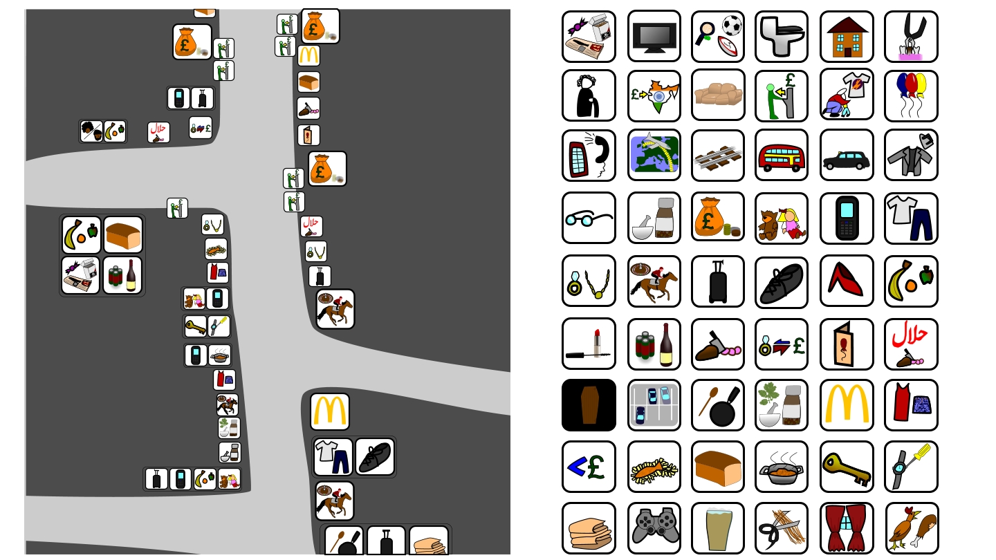
I restricted myself to East Ham high street, because it has markers at each end denoting where the ends are, and otherwise I could end up going forever. I mean, there's no line in the road where it says this side is East Ham this side is Plaistow, but for East Ham high street (or high street north) there is. I walked up the high street and recorded what each shop sold in a little diary, then I created symbols that sometimes by themselves are enough to tell you what a shop sells, and other times combining a few symbols together gave you the impression of what it sold.

Here are my symbols:
Photobucket
And here is the map of East Ham high street that I believe should be readable to anyone:


Photobucket
Photobucket
Photobucket Photobucket
Photobucket
Photobucket

Annoyingly I can't get this map to all line up properly on my blog, but I'm sure you get the idea. I'm quite pleased with how it came out, and I think I'm definitely right about what graphic design is. Graphic design is not a pretty picture and it's certainly not an acrostic poem, it's good communication. If you can understand this map then I've been successful in creating a visual language, I read these symbols as if they were written in english these days, so I can't tell how successful they are, but I think they work.

Thursday, 23 February 2012

Mirrors

This project was all about our Home. For me my home is where I live, and for the past 4 years that's changed each year. Some people make this big deal about how somewhere else they arn't living is their home, but I think they're idiots. My mom and dad's house is my mom and dad's house, their home. It used to be mine, but I have my own house now, and that's my home. This information upsets my parents, but the thing is, where do you draw the line? Why say that Birmingham's my home when I was born in Croydon and spent the first few years of my life growing up there? I haven't lived at my parents for 3 years now, I just don't get why that'd be my home.

Anyway, so I based my project around my current house. I started off by trying to make a book that catalogued all of the objects in my house in a Victorian style . This is because I've got quite a good memory when it comes to attaching stories to items and with my 3 flat mates I'd learnt the history of the items they'd brought with them, and knew the history of all the things that had been bought whilst we'd been living here. However, after tea staining all of the pages of this book and doing a few items I decided that this book was development work at best, and it felt like such an insurmountable task that it ceased to be fun, so I stopped doing it about 10 objects in. The reason I was going for a Victorian style is because my house is Victorian. This book has since gone missing unfortunately, one thing that I didn't get across was how filthy my house can be. Here is an example of the living room at the moment:
Photobucket

And that's how things like my catalogue of objects book go missing. I tend to be pretty on top of tidying the place up, but we had a party last week and since then I've been too busy to sort the place out, Jack's always hidden in his room, Grace doesn't believe she has any responsibility to the mess (she doesn't, it is mine and Chloe's) and Chloe's too busy to tidy too, she does fashion design and that's why there's fabric shit everywhere.

So I needed a fun way of documenting my house, and I thought what would be better than a video? But what sort of video is good for explaining things? Childrens' tv! So using the puppet Rabbitpuss (a fantasy creature made out of a real rabbit that me and Grace imagined was our cat once cause we missed not having a cat each, it's also an odd way of allowing us to touch one another because my 17th century morals forbid me from touching people or something in my brain isn't wired up quite right) I filmed the kitchen, with descriptions of all the things that stand out in the kitchen to me as well as an interview with Grace. I started with the kitchen because where the dinner's made is sort of where the heart is, Chloe only cooks for her boyfriend (/ex-boyfriend? she doesn't know either, silly girl's just being mugged off by him if you ask me) and he isn't round that much any more and Jack only eats cereal and take away pizza, so the kitchen always kinda felt like mine and Grace's space anyway, and that's why there's an interview with Grace in there.

It was aimed at about 4-5 year olds, with a few tongue in cheek moments (like Gracey with her knife) because I like to pervert things.

After putting this video together and seeing that it totalled about 6 mins I thought to myself, this is already a long amount of footage to watch considering it's me talking to a puppet about objects in my house. Would I really be adding anything other than just filler content by doing the rest of the rooms? Would anyone want to watch another 25 minutes of this? I didn't think so, so here is "My Home", because Grace making dinner for me is my favourite part this home anyway (she's a good cook amongst other things).


One thing a lot of people forget when it comes to video is that editing things out is the most important part (by this I mean those people from the first year project near the end, the public drawing one. Go back in time on my blog a bit and you'll a more detailed account of my thoughts regarding those idiots). Editing all the video of my house down to just one specific room is good editing in my opinion, I couldn't have had it any shorter than this I feel, and the video is quite a good descriptor of my stance on the people I live with as well I'd say.

There's a lot of extraneous information here to the untrained eye, but really it's all about my home and my outlooks on life, so it makes sense as a Mirror in my mind at least, just quite a text-y reflection!

Wednesday, 8 February 2012

Disaster waiting to happen!

In this project we had to invent a disaster of some sort, make something to spread hysteria about it, then make an 8 page landscape booklet with solutions to the disaster.

My idea was the biblical rapture but for people who don't believe in god.

I decided to make a terrorist-esque video message but from the antichrist, who had risen up out of Angela Merkel. I did a german accent but in the video the audio's distorted so it sounds more devil like. I also wanted to have a couple horror movie bits, to expunge the idea that this was an evil video message, so I reused my Justin Beiber mask and Madeline McCann mask doing some weird things.

For the words I was going to say in the video I took ideas from this Paradise Lost quote:

"2:880-884

With impetuous recoil and jarring sound

Th’ infernal doors, and on their hinges grate

Harsh thunder, that the lowest bottom shook

Of Erebus. She opened, but to shut

Excelled her power; the gates wide open stood"

and combined it with some ghost buster inspired stuff (from when they're fighting on top of the building at the end of the first one against Zool), and then I added the german accent to get:

"Ze Great Tribulation iz upon you!

For I am ze Anti-Christ, Und I am rizin!

Zer shall be harsh tunder, Und ze ground shall shake

Fire vill vrain upon you, as plague Und vor vrack ze peoplez!

Hear ze trumpet cry, to ziz cocophony I, ze vurld chancellor, shall lead you!

Ze Infernal doors are open, Und ze Beast valks among you!"

I tried to get as many Ws in as possible and swapped commas for ands so I could pronounce things that sounded out the german accent more.

I made the Angela Merkel mask, adding horns in Illustrator, then printing it out, sticking it to cereal box cardboard and punching some holes in either side, each one gets a pipe cleaner through it and then you tie them up at the back of your head. You can also see the Maddie mask that features in the video (this mask was made for last Halloween, I felt like it pushed the boundarys of halloween masks, as did a few other people, one polish woman attacked me and several people shouted at me, I had to take it off at the request of someone I was walking with who was fearing for his life).


Photobucket


I made the flame background out of 3 sheets of A3 paper, stuck landscape to landscape to landscape with thick black tape so they were in a loop. Then I drew out the shape of fire and painted it with acrylic paint, the advantage of using the black tape was that I didn't have to paint half of each join. I put bottles at either end then, whilst I sat with my head in front of it, my house mate Jack (who also plays Justin Beiber) pulled at it so that it moved round. After messing with the video on the computer this made it look like Angela Merkel was moving about in front of a flaming background.


Photobucket


Here's the video:


After that I put together the booklet, I found out what the actual effects of the rapture according to the book of revelations from the bible.
-water turns bitter
-large increase in the number of snakes
-plagues and a general increase in illnesses
-endless thunderstorms
-raining fire
-locusts formed into charioteers
-demons marauding around (including the four horsemen of the apocalypse)

and then learnt what the practical solutions to these problems were.

Here's the 8 pages of the booklet:


Photobucket


Photobucket


Photobucket


Photobucket


Photobucket


Photobucket


Photobucket


Photobucket


The criticism I received was about the quality of paper it was printed on, and it wasn't double sided. If it was double sided I'd have to rearrange half the pages so I had the text on the left and the picture on the right. Also it was said that the Impact font and Garamond didn't go well together. But I wanted a shouty font for the titles and a more refined font to describe what to do in each situation. Surviving through the rapture is a very survival of the fittest time, and I tried to get across this idea through humour that the chance of survival was minimal. The last point against was that on the hunting snakes page the text comes to close to the bottom of the page.

I showed it to my friend Rosie the next day in illustration and her first thought was that it was a real publication from the uni until I said that I'd made it, which was pretty cool. I think that if I had got it printed double sided and on a better quality paper it would look really authentic.

I've reworked the booklet now so that the pages in it are double sided, it looks more professional as a result, as well as shortening the text in the Snake page so that it doesn't run so close to the edge of the page.

Wednesday, 11 January 2012

Brand New

I got the brief second hand off someone and jotted down that I had to:

Create something new/appropriate other old ideas into something new. so design something that is ultra new idea or something that proves there isn't any new ideas.
fiction and science fiction were ok.

I realised that this was in fact the perfect opportunity to unveil the Smib upon the world. I'd been saying for quite a while how my leisure time would be massively improved by some sort of device that would stop ash from what I was smoking landing on my clothes.

I had a few naysayers "oh that's not an original idea!" well, what's not original about it? I know bibs exist, but they exist so that babys don't get loads of food down their front. This is designed for adults so they don't get ash down their front, and as such has to have different properties.

My housemate Chloe is skilled in textiles and leant me a book about fabric properties. With her help I created the Smib prototype out of hardwearing cotton, sort of like denim, only with a fish pattern on that is pleasing to look at.

Photobucket

That's enough explaining from me about the Smib though, over to the television campaign:


I'm not sure how, but the "there's no new ideas" crowd managed to get a better mark than me, despite their contribution to the "brand new" project being regurgitating the words of philosophers, hardly an original thing in my opinion, compared to a brand new actual product in the class room.

I'm considering doing a whole line of consumerist products that would help you to sin (from the 7 deadly sins, the Smib helps you with slovenliness) To show that the Smib is a real product I've designed it with a few different patterns and colours for those people who don't want to look down at their chest and see fish. Photobucket There is the standard fish design, the Rasta flag, a floral print, cannabis leaves, leopard print, a green with gold trim version, my personal favourite: the no smoking sign smib, and lastly the sky print smib. Here is a picture of me modelling the smib: Photobucket I have received several requests for Smibs, my production team has been too busy for me to commit to selling them to people, but I've had around 10 people ask if they can buy one off me, which at 18 quid a go is pretty good. I'd split the money 50/50 with Chloe cause she's the one sewing it for me, but from the first one onwards I'm making money just off of her working (cause she said she'd get the materials). I know that some people won't agree, but money to be made is a good way of measuring the quality of a product, and is there any chance of say someone making any money out of saying there's no new ideas? No. A brand new product that revolutionises the way you relax? yes. I use my Smib regularly, and there's been times where I've forgotten to put it on and been exasperated after spilling ash on myself. Watch this space!